The elite of the tech industry are unrivaled in their ability to stand on a stage and earnestly pitch you something you’ve seen before as stunning, groundbreaking, unprecedented. This is an important skill, because much as history repeats itself on a grand scale, design trends repeat on a cycle of 10 or 20 years or so. Skinny jeans are back, and after a few years dabbling with sharp corners and flat colors, computer interface design is ready to be translucent again.
So declares Apple with its new “Liquid Glass” aesthetic, revealed today as the centerpiece of the upcoming iOS 26 and MacOS 26—or as we called it back in the late 2000s, Windows Aero.
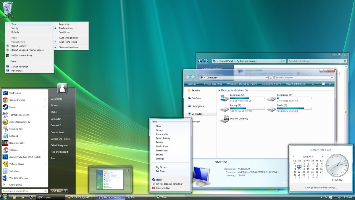
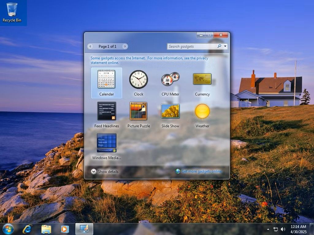
The computer I owned in 2007 wasn’t powerful enough to run Windows Vista, but I was nevertheless smitten with its use of transparency and frosted glass across the operating system. It was so sleek and futuristic next to XP’s bubbly primary colors. I installed a Vista skin on my XP machine just to bask in some fraction of its glory (and avoid all the problems that made Vista one of the worst versions of Windows ever). So Apple can declare all day that Liquid Glass “combines the optical qualities of glass with a fluidity only Apple can achieve,” but I know better. Microsoft went there and did that 18 years ago.
Image 1 of 2
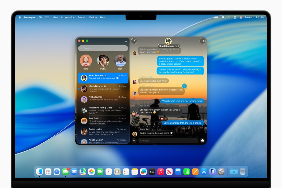
I haven’t used Apple’s new OS yet, which is only available in a developer beta, but I feel like you might be scraping the bottom of the barrel for talking points when your blog post about Liquid Glass touts features like “a completely transparent menu bar that makes the Mac display feel even larger” and rounded control menus in iOS that “establish greater harmony between hardware, software, and content.”
We all know how this goes: round is in right now, but sometime in the next decade we’ll move back to rectangles being hip, and a very rich executive will go on stage to explain with a straight face how useful it is to get back those 37 pixels they’d previously shaved off each corner.
Image 1 of 2

And aren’t you tired of how busy your screen looks when you can kinda see through one thing to the thing behind it? Well, through a lot of hard work and innovation, they’ve managed to make the whole computer solid again. Would you like to hear the good word about pastels?
Anyway, Apple’s Aero looks pretty nice! Just as nice as when Microsoft polished up Vista’s glass aesthetic and really refined it for the all-timer OS, Windows 7. What a great time to be on the computer that was. I’m looking forward to Windows 7 Nostalgia Edition once Microsoft’s designers decide they, too, wanna get frosty again.